Preparing a Poster Presentation
Diomidis Spinellis
Department of Management Science and Technology
Athens University of Economics and Business
Athens, Greece
dds@aueb.gr
How to Setup a Brilliant Poster Stand
Elements that make up a good poster stand:- A visually striking poster
- A physical object related to the work (physical demo, mascot)
- An auto-running presentation or demo running on a PC
- A leaflet to take away
- Related publications (papers, book)
- A knowledgeable presenter interested on the topic
Drafting the Poster Advice
- Print your poster on A0 paper (smaller only if the organizers specify it)
- Prefer a mat to a glossy surface
- Avoid extended text runs
- Use large (sans-serif) fonts
- Liberally use graphical elements
- Clipart
- Pictures
- Diagrams
- Graphs
- Rotated text
- Markup the poster areas using large color expanses
- Try to come up with an original and interesting layout
- Make the graphics of the poster tell a story, using elements such as arrows and pictures
- Consider providing a mechanism for obtaining feedback
- Include the contributor's names and contact information (including web site)
- Don't forget to mention your sponsor (if any)
Poster Examples: Good Use of Color
The following are some good examples of posters that use color to stand out from the crowd. Click on the images for a larger version.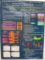
(EURO XX 2004)
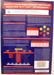
(EURO XX 2004)
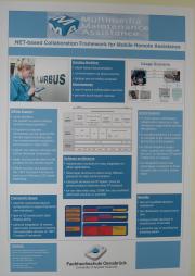
(MSAD 2004)
Poster Examples: Liberal Use of Graphical Elements
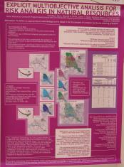
The following are some good examples of posters that use graphics to bring their message across. Click on the images for a larger version.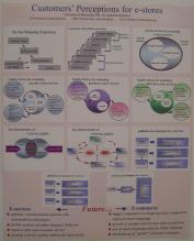
(EURO XX 2004)
(EURO XX 2004)
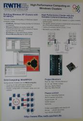
(MSAD 2004)
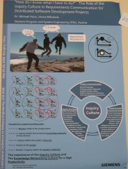
(ICSE 2006)
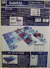
(ICSE 2008)
Poster Examples: Graphics that Tell a Story
The following are some good examples of posters that use graphics to guide the reader through the story. Click on the images for a larger version. See also the interesting layout examples.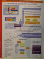
(EURO XX 2004)
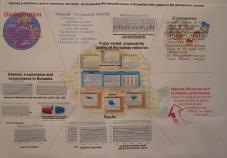
(EURO XX 2004)
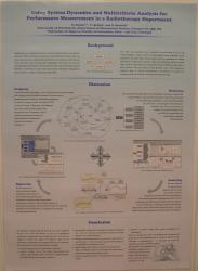
(EURO XX 2004)
Poster Examples: Interesting Layout
The following are some good examples of posters with an interesting layout. Click on the images for a larger version.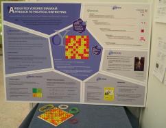
The layout is self-referential. The work describes the use of Voronoi diagrams (http://en.wikipedia.org/wiki/Voronoi_diagram) for vote districting, and the poster layout follows the same scheme. This poster won the conference's best poster award. (EURO XX 2004)
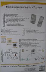
(MSAD 2004)
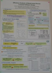
This slide (although a bit crowded) uses numbering and nested layouts to guide the reading order. (ICSE 2006)
Poster Examples: Adding Hardware
The following are some good examples of posters that have additional "hardware" elements pasted on them. Click on the images for a larger version.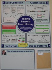
The slide includes a folder with a copies of it, and an area for adding comments. (ICSE 2006)
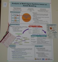
Another approach for collecting comments: a notepad and a pen hanging on a pin (ICSE 2006)
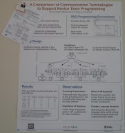
This slide has copies and business cards attached to a paper fastener. (ICSE 2006)
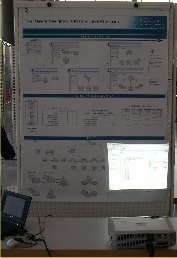
This slide includes a blank area where a projector shows a demo of the software. (ICSE 2008)
Poster Examples: Making do Without a Big Format Printer
You don't necessarily need access to a big-format printer to create a good poster. If you find yourself stranded without suitable hardware (e.g. wanting to create a poster on the spot at the conference) you can improvise by assembling printed A4 sheets, or even by writing and drawing your poster in flip-chart paper. Here are two examples. Click on the images for a larger version.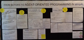
This poster is assembled mainly from printed A4 sheets, placed in an interesting pattern. (SPLASH 2012)
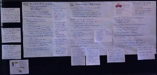
This poster is written by hand on flip-chart and A4 sheets. The placement of the A4 sheets is used to indicate how they relate to the larger flip-chart sheets. (SPLASH 2012)
Poster Counterexamples
The following are some counterexamples of the poster design techniques I described. To protect the guilty, you can not click on the images for a larger version.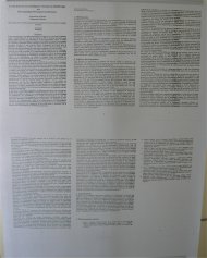
The paper's pages printed on an A0 sheet
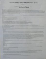
The paper typeset and printed on an A0 sheet; this is worse the previous example, because our eye can't follow printed lines spanning half a metre.
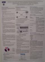
Too much and small text, not enough color (EURO XX 2004)
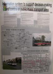
Too much information (text and small diagrams), glossy paper (EURO XX 2004)
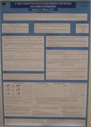
Too much and small text (EURO XX 2004)
Stand Examples
The following are some good examples of stands following the guidelines I described. Click on the images for a larger version.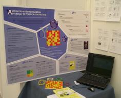
The perfect setup: poster, book, physical demo, laptop, presentation. The board allows the demonstration of Voronoi diagrams (http://en.wikipedia.org/wiki/Voronoi_diagram) using nails and rubber bands. This poster won the conference's best poster award. (EURO XX)
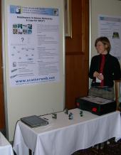
A live hardware demo (MSAD 2004)
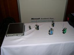
Closeup of the live hardware demo (MSAD 2004)
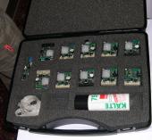
The perfect packing for the demo (MSAD 2004)
Packing List
Bring with you the following items:- The poster (protected in a sturdy cylindrical container). Seal the container's covers with adhesive tape, because they can fall off in the airport handling.
- Double-sided adhesive tape and scissors, pins, or Blue-tackTM
- The physical object, suitably protected
- Business cards with up to date contact information
- Promotional leaflet
- A laptop for running the demo
- The demo on backup media (CD-ROM, USB stick)
- Publications to distribute (e.g. paper reprints)
- Publications to display (e.g. a book)
- Giveaways: posters, pens, buttons, candy, CDs, T-shirts
- An attire appropriate for the occasion - consider wearing a T-shirt with the research project's logo
- Drinking water
- Reading material, to pass your time if attendance is low